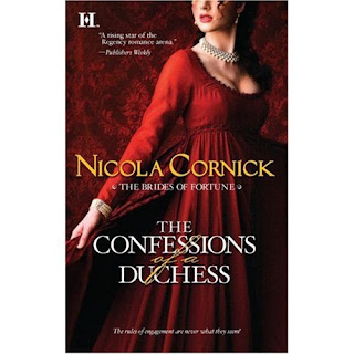
The case of the headless bodice!

Here is the first cover for my new HQN Regency series, The Brides of Fortune, which will be coming to a bookstore or internet bookseller near you in June! I am SO excited to see the covers for my new series, which are all in this beautiful style. Over the next few weeks I'll be posting all the covers and some juicy details about the series!
I've noticed that the "headless bodice" cover seems to be increasingly popular with publishers and has featured on historicals by Phillipa Gregory, Elizabeth Chadwick and Mary Balogh, amongst others. In this case of course the heroine isn't totally headless, just cut off somewhere around the nose. And whilst this may not sound very attractive, I think the cover looks gorgeous. But what do YOU think? Do you like covers where there's a little bit of mystery about the appearance of the hero or heroine, or do you prefer a full face version or even a full body version of hero and heroine together? Let me know!


Comments
(Actually, I'd quite like a waist, too, but you can't ask for too much in this world.)
To answer the question - I like a bit of mystery, and I like the cover to reflect what's inside the book.
I love these kinds of covers. As Jan said, they add a bit of mystery and they allow the reader to picture the characters as they are described in the book rather than as they are depicted on the cover.
Hugs,
Julie
Wendy, that was the Kidnapped cover, wasn't it. I did point out to my editor that the heroine was a redhead, but to no avail. Checking with my HH colleagues I hear this happens with covers quite a lot (sigh.) It was a very pretty cover but I must admit that I do prefer my HQN ones.
Hello Julie! I'm so pleased that you like it. And I agree that it does allow readers to use their imagination to fill in the picture of what they think the character looks like.
(Mind you, your name on a book always means I'm going to enjoy the contents. Currently enjoying Unmasked.)